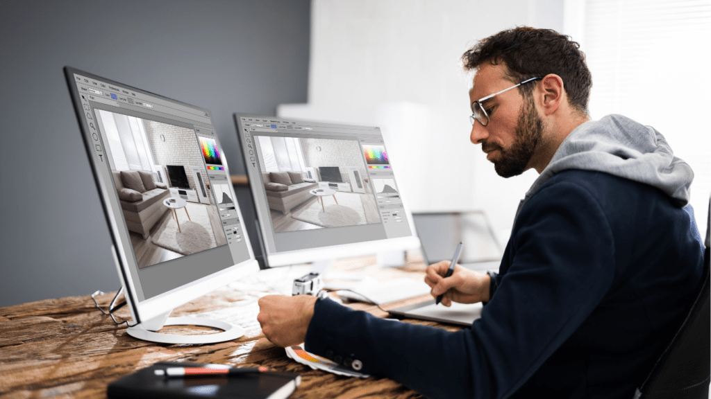
As a photographer, I’ve learned that editing for print and editing for the web are two entirely different worlds. What looks stunning on a glossy magazine page might not translate well to a digital screen, and vice versa. Understanding these differences is crucial if you want your work to truly shine, no matter where it’s displayed.
When editing for print, there’s a focus on high resolution, color accuracy, and fine details, while web editing demands optimization for screen viewing, faster loading times, and vibrant colors that pop. It’s not just about the tools you use—it’s about knowing your audience and the medium they’ll experience your work through.
Understanding The Differences Between Print And Web Editing
Editing for print and web differs because both media have distinct technical and visual requirements. Recognizing these differences helps photographers tailor their images for maximum impact in each format.
Key Characteristics Of Print Media
Print prioritizes resolution and detail because physical prints demand high-quality output. Images for print typically require a resolution of 300 DPI for sharpness and precision. Print editing relies on CMYK color mode to match ink colors, ensuring accurate reproduction of hues. Subtle adjustments, like fine-tuning highlights and shadows, enhance the images when viewed up close. Finally, print output often uses paper texture and quality, which interact with the image to influence its visual appeal.
Unique Features Of Web Content
Web content emphasizes screen optimization for faster loading and adaptability across devices. Images for the web are generally compressed to lower file sizes without significant quality loss to improve website loading speed. The RGB color mode ensures vibrant and dynamic display on digital screens. Additionally, web editing often includes resizing and cropping to meet specific platform requirements, such as a 1080 x 1080-pixel format for social media posts. Interactivity, like hover effects or clickable elements, can also be a factor for web-based visuals.
The Importance Of Resolution And File Formats

Resolution and file formats determine how a photograph is displayed in print or on the web. Understanding their roles ensures image quality and consistent visual impact across mediums.
Print Resolution: DPI And Its Impact
Print resolution relies on DPI (dots per inch), where higher DPI values produce sharper, more detailed images. For professional-quality prints, images typically use 300 DPI to maintain clarity and avoid pixelation. The higher the DPI, the more details are captured, which is crucial for large-format printing. Adjusting DPI directly impacts the physical size of the print, so I always ensure my resolution matches the dimensions needed.
Web Resolution: Optimizing For Screen Display
Web resolution focuses on PPI (pixels per inch), with 72 PPI or 96 PPI widely used for most devices. Lower pixel density improves loading speed while keeping images sharp on screens. Unlike print, resizing for web projects requires careful compression to reduce file size without sacrificing visible quality. I always check that images remain vibrant and optimized for the RGB color space, as it aligns with screen displays.
Choosing The Right File Formats
File formats affect how images are stored, displayed, and compressed. For print, I prefer formats like TIFF or PSD, as they retain maximum detail without loss of quality. When preparing images for the web, JPEG and PNG dominate; JPEGs are ideal for photographs due to smaller file sizes, while PNGs work well for graphics with transparency. Selecting the proper format prevents quality loss and ensures compatibility with the intended medium.
Color Profiles And Their Role
Color profiles directly affect how images appear across mediums. For photographers, understanding these profiles ensures accurate color representation in both print and web environments.
CMYK For Print
CMYK (Cyan, Magenta, Yellow, Key/Black) defines how printers layer ink to reproduce colors on paper. This subtractive color model creates hues by reducing light from a white canvas. When I edit for print, I ensure my images are converted to CMYK format to avoid color mismatches between digital proofs and printed copies. CMYK images might appear duller on screen compared to RGB, but they transition better onto physical media like books, posters, or brochures. Soft proofing in CMYK before printing helps predict final output and adjust tones accordingly.
RGB For Web
RGB (Red, Green, Blue) colors are optimized for digital screens, using an additive model where colored light combines to create vivid displays. Web images retain brightness and vibrancy in RGB, enhancing their appeal on devices like:
- computers
- smartphones
- tablets
I use screen-calibrated settings for RGB editing to guarantee consistency across displays. Exporting images in RGB format ensures compatibility with the vast majority of web platforms and preserves color intensity. RGB also supports higher variations of dynamic colors, vital for web-based visuals like banners and multimedia content.
Adjusting Image Dimensions And Cropping
Image dimensions and cropping impact how photographs are perceived across print and web platforms. Ensuring optimal dimensions and aspect ratios for the intended medium enhances image quality and visual impact.
Preparing Images For Print Sizes
- Print images demand precise dimensions to maintain sharpness and avoid distortion.
- I use a resolution of 300 DPI, adjusting dimensions to match the print size, such as 8×10 inches for portraits or 24×36 inches for large prints.
- Maintaining the original aspect ratio during cropping prevents unintended stretching or compression.
- If specific crops are necessary, I calculate the required dimensions beforehand to align with the final print format. For instance, gallery prints often follow standard ratios like 4:5 or 3:2.
- I also consider bleed and trim areas, adding 0.125 inches to each side when images need full-bleed printing.
- This ensures no essential part of the image gets cut off during trimming.
- Accurate cropping and sizing maintain the integrity of the image while preparing it for seamless print reproduction.
Adapting Images For Responsive Web Design
Images for web use require dimensions optimized for screen resolution and platform specifications. I prioritize resizing images to suit their display context, such as 1920 pixels wide for a website banner or 720 pixels for a blog thumbnail. Cropping for web involves aligning images to platform-specific aspect ratios, like 16:9 for videos or 1:1 for social media posts, ensuring balanced composition.
Web cropping also considers responsive design. I prepare multiple image versions at different scales, such as 500, 1000, and 1500 pixels, to adapt to varying screen sizes. Cropping avoids placing key elements too close to edges, maintaining focus whether the image is viewed on a desktop or mobile device. By aligning with platform requirements, adjusted images improve load times, clarity, and user engagement.
Managing Contrast And Brightness
Managing contrast and brightness differs significantly between print and web editing. Each medium demands tailored adjustments to ensure images maintain their intended visual impact.
Print-Specific Considerations
For print, contrast and brightness adjustments must account for the absence of backlighting. I focus on ensuring shadow details are preserved, as excessive contrast can obscure subtle textures on paper. Reducing overly bright areas helps avoid a washed-out look due to the reflective nature of print materials. I also use soft proofing tools in CMYK mode to simulate the final appearance on the chosen paper, enabling fine-tuning of midtones and highlights for accurate reproduction.
Web-Specific Adjustments
Web editing emphasizes vibrant and dynamic visuals, as screens rely on backlighting. I often increase contrast slightly to enhance depth and make images pop on bright monitors. Brightness adjustments must balance visual clarity without overexposing light areas, which can look harsh on digital displays. Since different devices display colors and brightness levels uniquely, I preview my adjustments across various screens and browsers, optimizing for consistency in RGB mode.


