Ever wonder why some photos instantly captivate you while others feel flat? The secret often lies in color grading. It’s not just about adjusting brightness or contrast—it’s about using color to tell a story, evoke emotion, and set the perfect mood. Whether you’re aiming for a cinematic vibe or a dreamy aesthetic, the right color grading can transform your photos into something truly unforgettable.
Understanding Color Grading
Color grading transforms raw images into expressive visual stories. It involves deliberate manipulation of colors to create specific moods and emotional responses.
What Is Color Grading?
Color grading is the process of altering and enhancing the colors in an image to achieve a particular aesthetic. It focuses on:
- tonal balance
- color harmony
- stylistic enhancements
While editing tools like contrast and brightness adjust basic exposure levels, color grading targets color temperature, saturation, and hue shifts for a more nuanced effect. For example, cool blue tones can evoke calmness, while warm orange hues might suggest warmth or nostalgia.
Importance of Color Grading in Photography
Color grading elevates photography by enhancing storytelling and emotion. It aligns the visual tone with the desired mood, ensuring a cohesive narrative. For instance, desaturated colors might create a sense of melancholy, while vibrant hues exude energy and positivity. Without thoughtful color grading, photos might lack depth and fail to engage viewers emotionally. Effective grading also maintains consistency across a series of images, essential in projects like portfolios, campaigns, and editorials.
Tools Needed for Effective Color Grading
Effective color grading combines the right software with suitable hardware to achieve precise and professional results. Choosing reliable tools enhances workflow efficiency and output quality.
Software for Color Grading
Specialized software streamlines color grading by providing advanced features and controls. Adobe Lightroom and Capture One excel for photo editing, offering intuitive interfaces and tools for managing color tones, saturation, and luminance adjustments. For more cinematic looks, I use Adobe Photoshop or Luminar Neo, which provide refined masking, curve adjustments, and robust color grading functions. Each program supports RAW files, ensuring maximum flexibility.
Free options like DaVinci Resolve or GIMP cater to learners or budget-conscious creators. DaVinci Resolve includes professional-grade scopes and color wheels, useful for precise grading. Plug-ins, such as Nik Collection or Exposure X, expand creative possibilities with additional ready-to-use presets and effects.
Hardware Recommendations
Reliable hardware enhances viewing accuracy and processing efficiency in color grading. A high-resolution monitor with 99% sRGB or Adobe RGB color accuracy ensures correct color representation. Models like Eizo ColorEdge or BenQ PD series excel in offering calibrated displays.
For smooth workflow, a system with a multicore CPU, at least 16 GB of RAM, and a dedicated GPU like NVIDIA GeForce RTX 3060 optimizes file handling and rendering speeds. A graphics tablet, such as a Wacom Intuos Pro, ensures precise tonal adjustments and brush control, especially in detailed edits. Accessories like calibration tools, such as SpyderX or X-Rite i1Display Pro, maintain consistent screen colors.
Mastering the Basics of Color Theory

Understanding the fundamentals of color theory is key to achieving impactful and emotive photo edits. Colors are more than visual elements; they are tools for influencing perception and emotion.
The Role of Colors in Mood Setting
Colors evoke emotions through their psychological and cultural associations. For instance, warm tones like red, orange, and yellow often convey energy, passion, or warmth, while cool tones like blue and green evoke calmness, serenity, or melancholy. Adjusting hues in photography helps create a narrative. For example, using desaturated blues can emphasize isolation, while vibrant yellows can capture joy.
I analyze the subject matter and intended reaction to choose a fitting palette. For portraits, I might emphasize earthy tones to create intimacy, while for landscapes, I enhance cooler hues for a tranquil vibe. Small changes in saturation or brightness directly influence how the image resonates with viewers.
Understanding Color Harmony
Color harmony ensures visual balance, making photos aesthetically pleasing. I rely on principles like complementary, analogous, and triadic color schemes when grading photos.
- Complementary Colors: Combining opposite hues from the color wheel, like blue and orange, creates contrast and energy. These are common in cinematic photography to draw focus.
- Analogous Colors: Grouping adjacent colors, such as green, blue, and teal, creates harmony and a soothing look. This is especially effective in natural or serene scenes.
- Triadic Colors: Selecting three evenly spaced hues, such as red, blue, and yellow, introduces vibrancy while maintaining balance, ideal for dynamic and striking edits.
I match the chosen scheme with the photo’s context. For a cohesive workflow, I always test combinations on a subtle level before deciding the final grade. Proper color harmony strengthens the emotional and artistic tone of every image.
Techniques for Mood Setting Through Color Grading
Color grading transforms the emotional tone of an image. I focus on using specific tonal adjustments to evoke the desired mood effectively.
Warm Tones for Cozy and Romantic Vibes
Warm tones, like golds, reds, and oranges, enhance feelings of intimacy and warmth. I increase the temperature slider slightly in editing tools to achieve this. Adding soft highlights in warm hues works well for portraits, creating a dreamy atmosphere. Combining warm saturation with lowered contrast deepens the romantic vibe, especially in low-light scenarios like sunsets or candlelit settings.
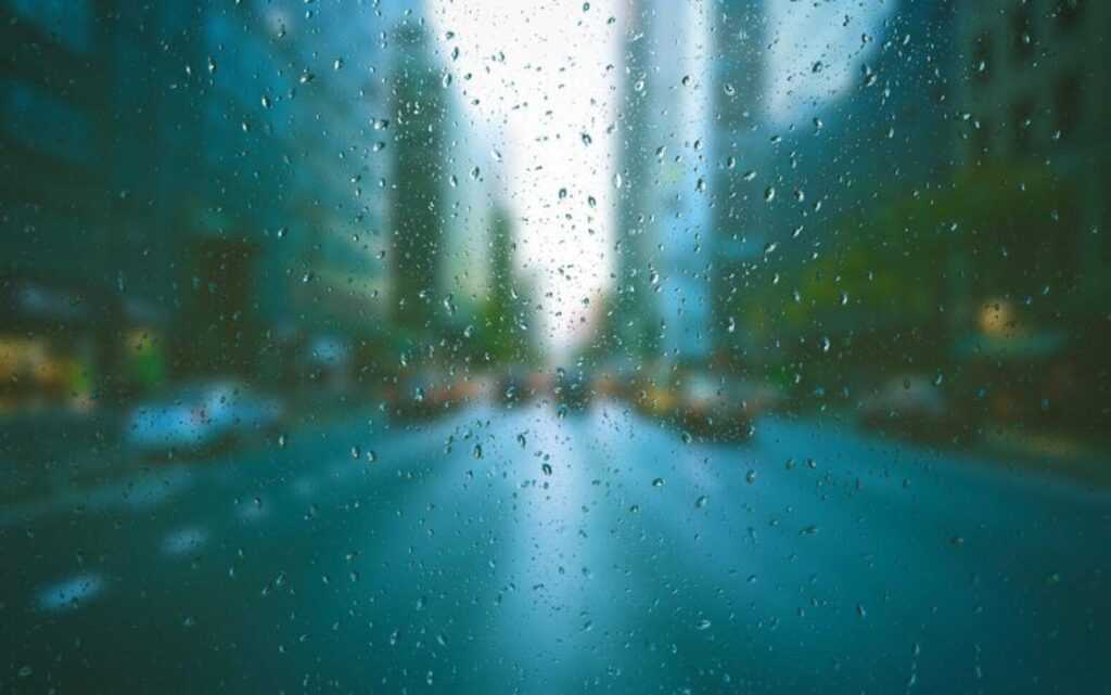
Cool Tones for Calm and Serene Impressions
Cool tones, such as blues, greens, and purples, evoke tranquility and peace. I adjust the white balance toward cooler temperatures and reduce saturation subtly for a more subdued look. For landscape photography, cooler shadows emphasize serenity while maintaining natural tones. Enhancing cooler midtones in sea or sky elements amplifies the soothing quality of such scenes.
Utilizing Shadows and Highlights for Dramatic Effects
Shadows and highlights shape the depth and intensity of an image. I darken shadows to create tension and heighten contrast for dramatic effects. Lifting highlights selectively, especially on key subjects, draws the viewer’s focus. Split toning shadows with cooler colors and highlights with warmer tones establishes a cinematic dynamic, ideal for storytelling and impactful edits.