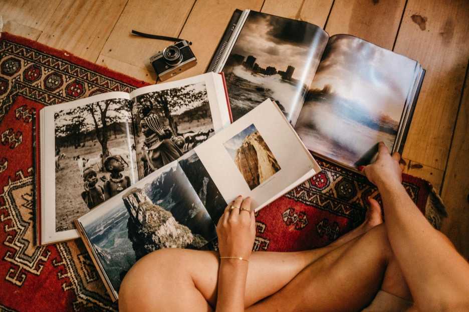
Photo by Jonathan Borba: https://www.pexels.com/photo/photo-of-person-holding-books-3021319/
Creating a photo book is one of the most reliable ways to preserve visual stories with structure and intention. Digital galleries often scatter memories across devices or cloud folders. A well-designed book forces curation, sequence planning, and narrative clarity. Different events, however, require different design logic. Weddings, travel sessions, and portrait projects each call for their own technical approach.
Using platforms like Mixbook photo books gives photographers and clients more control over layout precision, paper weight, and color handling. Details matter because each event places unique demands on pacing, image ratios, and stylistic cohesion.
Below is a breakdown of how to tailor photo books for each event type with technical accuracy and clean storytelling.
Designing Wedding Photo Books with Structure
Wedding images follow a chronological arc, making sequencing critical. The book needs to move from preparation to ceremony to reception without losing emotional continuity.
Begin by sorting RAW or high-resolution files into time blocks. Weddings typically involve inconsistent lighting conditions such as bright exteriors, dim receptions, mixed temperature indoor bulbs. Apply white-balance corrections batch-by-batch before selecting images. This ensures consistent color from page to page.
Use full-bleed spreads for high-impact portraits or key moments such as first looks, vows, or the first dance. These images benefit from uninterrupted space because they carry emotional weight. Smaller grids work well for candid sequences, allowing multiple expressions or reactions on a single spread.
Technically, matte papers reduce glare, which helps with images containing white dresses or sharp contrast. Glossy papers work well for colorful receptions but can reflect ambient light during viewing.
A final note: avoid overcrowding. Wedding books become stronger when each spread breathes.
Building Travel Photo Books That Capture Place
Travel books require geographic and environmental organization rather than emotional chronology. Locations, textures, and cultural elements shape the narrative.
Start by grouping photos by region, not by day. This prevents redundancy—multiple days may include similar scenes. Select long-shots, mid-shots, and close-ups for each area to create visual balance. These variations help the viewer understand scale and context.
Travel photography often mixes landscape, street, architecture, and food imagery. Keeping a consistent color grade, even when scenes vary, creates cohesion. Many photographers prefer a mild contrast boost with warm highlights to reduce haze from outdoor environments.
Maps or minimal text can aid navigation, but use them sparingly. A clean layout emphasizes imagery. Consider adding location tags on corners rather than using full captions.
A study from the Pew Research Center found that 82% of adults say photographs are among their most valued personal records, which explains the increasing demand for printed travel archives.
Travel books function as both personal keepsakes and documentary records. Precision in layout makes them more legible and enjoyable.
Crafting Portrait Photo Books with Style Consistency
Portrait books differ from wedding and travel projects because they rely heavily on tone. Consistency across lighting, grading, and posing ensures the book feels intentional rather than fragmented.
Begin by selecting a single color palette or black-and-white scheme. Switching styles too often introduces visual noise.
For lifestyle portraits, keep compositions loose. Allow negative space to frame the subject. For studio portraits, use centered layouts or symmetrical grids that support controlled lighting setups. Portrait books benefit from white or neutral background pages because they place attention on skin tone and micro-expressions.
When working with headshots or editorial portraits, add variety through page rhythm. Alternate full-page images with small triptychs to prevent visual monotony.
Technically, heavier paper stock improves portrait reproduction by enhancing tonal accuracy and reducing shadow banding. Smooth finishes also prevent texture interference with fine facial details.
Tools and Techniques That Improve All Photo Books
Event-specific design is important, but certain principles apply to all book types.
Key techniques include:
- Select fewer images: Strong editing increases emotional impact.
- Maintain aspect ratio integrity: Avoid stretching or cropping excessively.
- Use consistent margins: Professional alignment matters visually and structurally.
- Calibrate your monitor: Color accuracy ensures prints match digital previews.
- Check bleed and trim lines: Keep critical details away from edges.
- Sequence with rhythm: Mix wide, mid, and close shots to avoid visual fatigue.
- Export at correct DPI: 300 DPI is standard for high-quality print output.
These fundamentals allow the content to lead.
When Software Makes the Difference
Quality photo-book platforms simplify technical tasks like alignment, spread stitching, and color reproduction. Services such as Mixbook offer calibrated templates that prevent layout distortion and support various paper types.
Template libraries also help photographers match book style to event type. A minimalist white layout works well for portrait compilations. Rich, textured templates support wedding themes. Clean, modern grids enhance travel imagery.
For photographers delivering client products, these tools reduce production errors and improve turnaround time, ensuring books arrive consistent across print runs.
Event-specific photo books require intentional curation, technical accuracy, and thoughtful pacing. Whether capturing a wedding, a journey, or a portrait project, the right structure helps preserve the story with clarity and style.


